Picture this: you’re handed a business card with a QR code promising access to exclusive content or a special offer. Excitedly, you pull out your phone to scan it, only to encounter frustration as the code fails to register. This all-too-common scenario underscores the pivotal role of QR code design in ensuring seamless user experiences. In an era where digital connectivity is paramount, QR codes act as conduits between offline and online realms, offering a myriad of possibilities for businesses and consumers alike. Amidst this landscape, the significance of employing a reliable free QR code creator cannot be overstated. By leveraging such tools, businesses can craft visually compelling and functionally robust QR codes that captivate audiences and drive engagement.
Design Principles for QR Codes
The primary function of a QR code is to be scanned easily and quickly. While it might be tempting to create a visually stunning QR code, functionality should never be sacrificed. High contrast between the foreground (the code) and the background is essential for optimal readability. The most successful QR codes strike a balance between aesthetic appeal and functional design, ensuring that they capture attention while remaining scannable.
Choosing the Right Colors
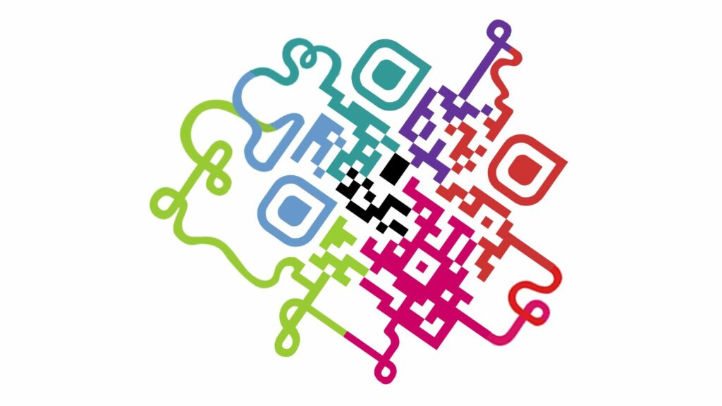
Color choice is a pivotal aspect of QR code design. While traditional black-and-white QR codes are the most reliable, incorporating brand colors can enhance visual appeal. However, reversed color schemes (light code on a dark background) can be problematic, as they may confuse some scanners. The safest bet is to use dark colors on a light background, ensuring sufficient contrast. For branding purposes, colored QR codes are viable but must maintain high contrast to avoid scanning issues.
Maintaining Square Perfection
QR codes are inherently square for a reason. Altering this shape can lead to data encoding issues and reduced scannability. While it may be tempting to get creative with shapes, maintaining the square format is crucial. Distorting the QR code can result in scanning errors, frustrating users and defeating the purpose of the code. The integrity of the square shape ensures that the encoded information remains intact and easily scannable.
Ensuring Readability Across Distances
The size of a QR code directly affects its readability. A code that is too small may not scan from a reasonable distance, while an excessively large code can be unnecessary and cumbersome. The minimum size of a QR code should be determined based on its intended viewing distance.

For most standard uses, a QR code should be at least 2 cm x 2 cm (0.8 in x 0.8 in) to ensure it can be scanned easily. Larger codes may be necessary for longer viewing distances, such as on billboards or large posters.
Clarity is Key
To maximize the effectiveness of a QR code, it should be placed in a clear and uncluttered area. Busy patterns or images behind or around the code can interfere with scanning, causing frustration for users. It’s advisable to leave a margin, often referred to as “quiet zone,” around the QR code. This margin helps distinguish the code from surrounding elements and improves its readability. A clear, distinct QR code stands out and is more likely to be successfully scanned.
Adding Value with a Clear Frame
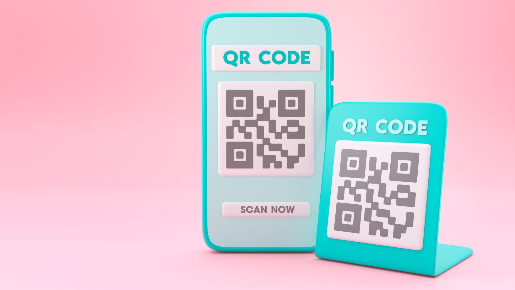
Adding a frame with a call to action (CTA) around a QR code can significantly enhance its effectiveness. A CTA provides context and encourages users to scan the code, making the purpose clear. Phrases like “Scan for more info” or “Scan to win” can entice users and improve engagement. When designing these frames, ensure they complement the QR code without obscuring it. A well-designed frame can guide users’ attention and improve the overall scanning experience.
Ensuring Flawless Scans
Before finalizing any QR code design, thorough testing is essential. Different devices and scanning apps may interact with QR codes in varying ways. Using free online QR code scanners for testing can help identify potential issues. It’s crucial to test the code in various conditions, such as different lighting and distances, to ensure consistent performance. This step ensures that the QR code functions flawlessly for all users.
Creative Design with Caution
While there is potential for creativity in QR code design, it is important to proceed with caution. Incorporating unique shapes, colors, or logos can make a QR code visually appealing, but not at the expense of scannability. Creative elements should enhance the design without hindering functionality. A balanced approach, where aesthetic enhancements do not compromise the code’s primary function, is key to creating an effective QR code.
QR Code Design Tools
Several online tools and generators offer customization options for QR codes, making the design process easier. These tools, like ME-QR, offer:

- Customization options for colors, logos, and frames.
- Features that support high contrast for readability.
- Tools for ensuring proper sizing and clear margins.
- User-friendly interfaces for easy experimentation.
Utilizing these tools can simplify the creation of functional and attractive QR codes, ensuring they effectively bridge the gap between offline and online experiences.
Creating effective and visually appealing QR codes involves a careful balance of design elements and functionality. Prioritizing scannability, choosing the right colors, maintaining the square shape, ensuring appropriate size, and avoiding distracting elements are key considerations. Adding a clear call to action and thoroughly testing the code across different devices can further enhance its effectiveness. While creativity is encouraged, it should never compromise the core purpose of the QR code. As QR code design trends evolve, staying informed about best practices will help in creating codes that capture attention and provide seamless user experiences.


